Vitasign Wrist Monitor
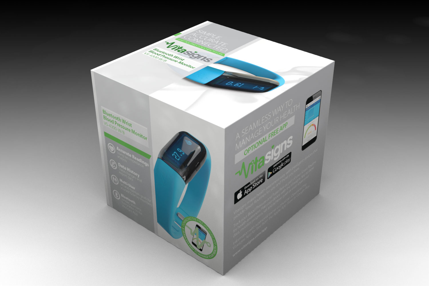
Tethos was tasked with 3D modeling and rendering a series of wrist monitors for a healthcare electronics company. These needed to be of photographic quality as they were being used as the product photographs on the packaging.
Tethos was tasked with 3D modeling and rendering a series of wrist monitors for a healthcare electronics company. These needed to be of photographic quality as they were being used as the product photographs on the packaging.
The first part of the packaging was creating a 3D model of the dazzle pro toothbrush and base and then using this to create photorealistic renders to be used as product photos on the packaging.
Tethos was tasked with creating the packaging for three different smart scales. The packaging required various views of the products to be used in different places of the package.
Each of the scales were created in 3D and then rendered out for the packaging.
A series of 3D models and renders done for the packaging of a desktop healthcare monitor.
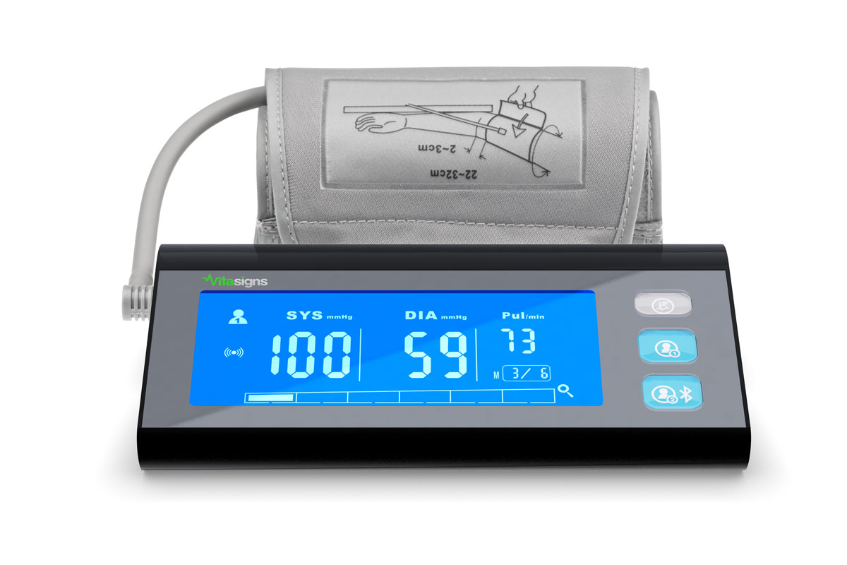

A series of renders done for the packaging of a heart monitor/blood pressure armband monitor.
Tethos was tasked with first coming up with a color study for a toothbrush travel case and then following this up with highly detailed, accurate 3D renderings of the chosen color.

A healthcare electronics company tasked Tethos with the packaging for their wrist activity monitor. In order to create the packaging, we first created high resolution, highly accurate 3D renderings of the product, allowing for unlimited freedom in creating the product photography used on the packaging.

A series of photos taken by Jason Niedle showing both the gritty and the colorful side of Cuba.
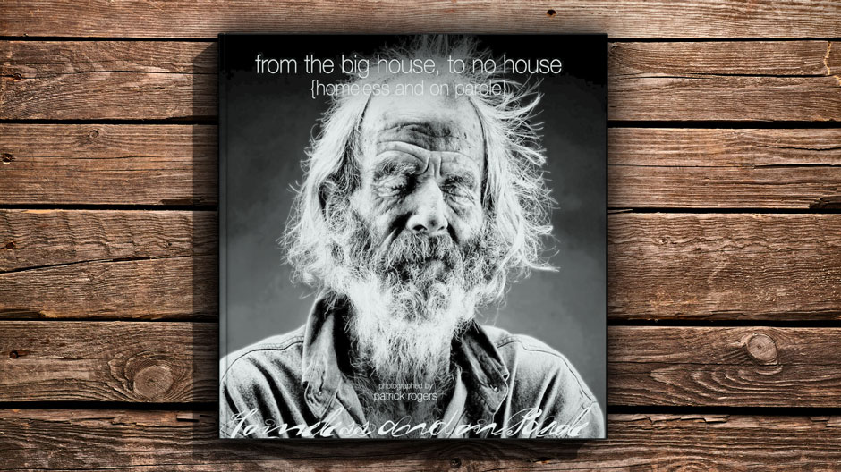
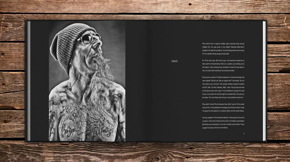
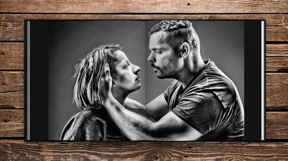
Fascinating fragments of the lives of homeless parolees – accompanied by masterfully handcrafted portraits – give us a look into a tragic world that most of us will never see ... yet is just around the corner.
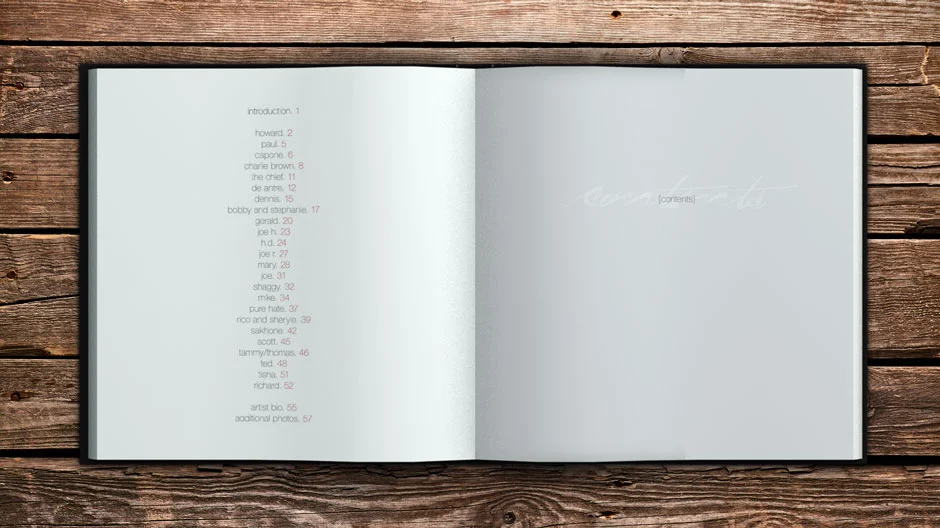
Tethos helped photographer Patrick Rogers create a telling portrait-driven book about the lives of the homeless in Orange County. We designed the cover and interior of the book, letting the amazing photographs take center stage.
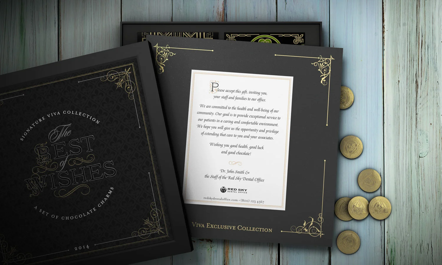
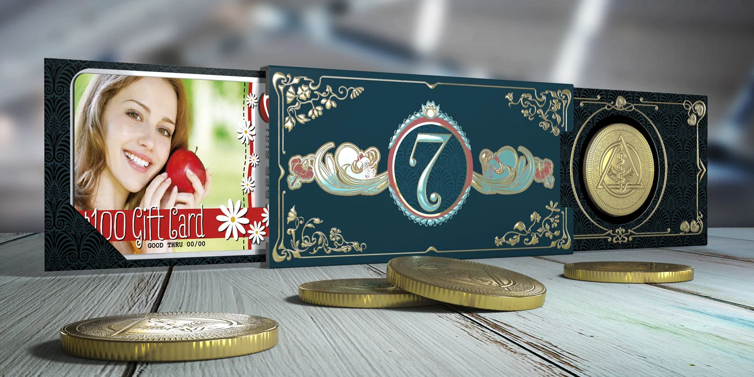
This award-winning design was created with the team at Viva Concepts and features a host of craftsmanship in addition to the detail-oriented design. Working as the center piece of a new campaign initiative, the Best of Wishes box featured a chipboard box holding 8 gift card sliders that also held chocolate coins.
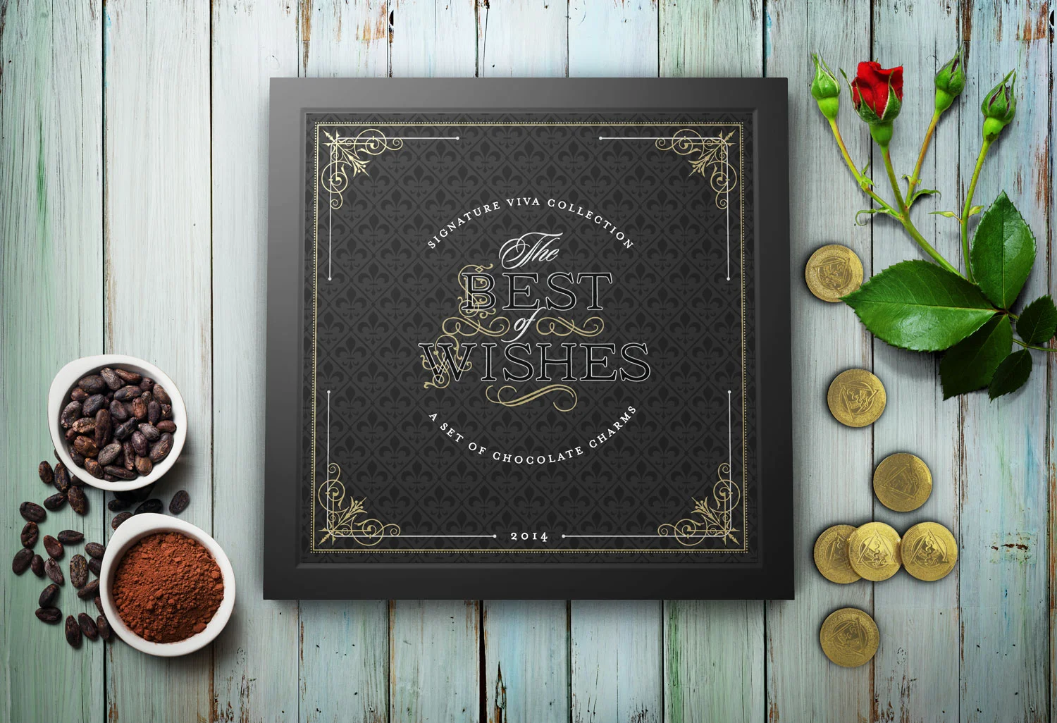
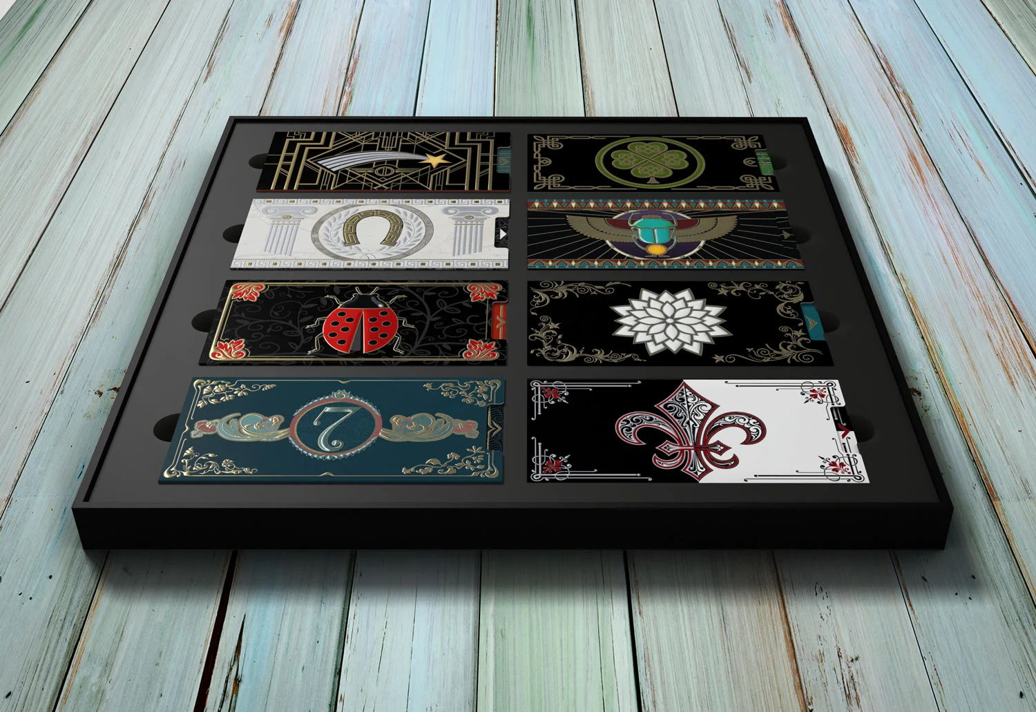
Each card slider featured a different good luck charm in a themed design—from egyptian to greek and art deco to art nouveau.
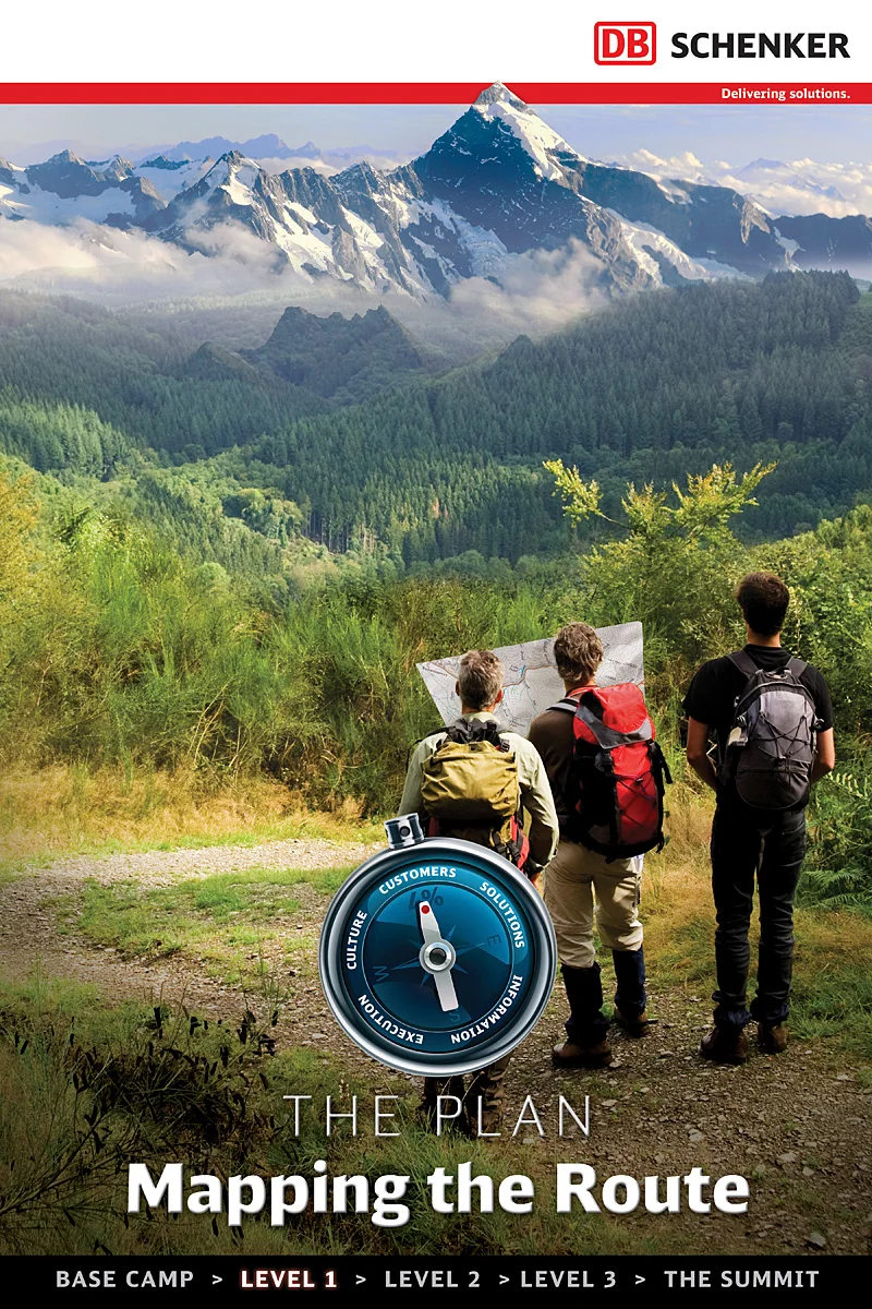
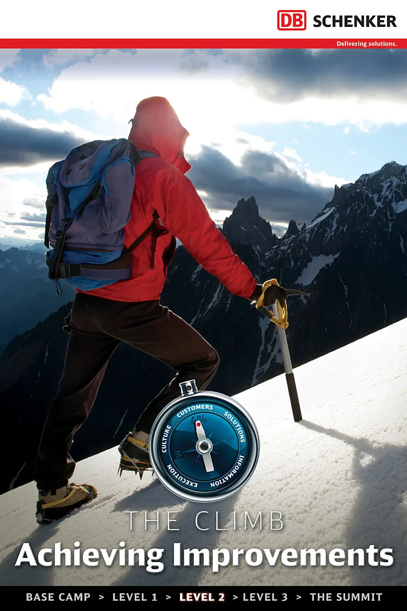
Tethos created a series of posters that were the center piece to a corporate campaign for the international logistics company, DB Schenker. Each posters was a step on a larger "road map" for success.



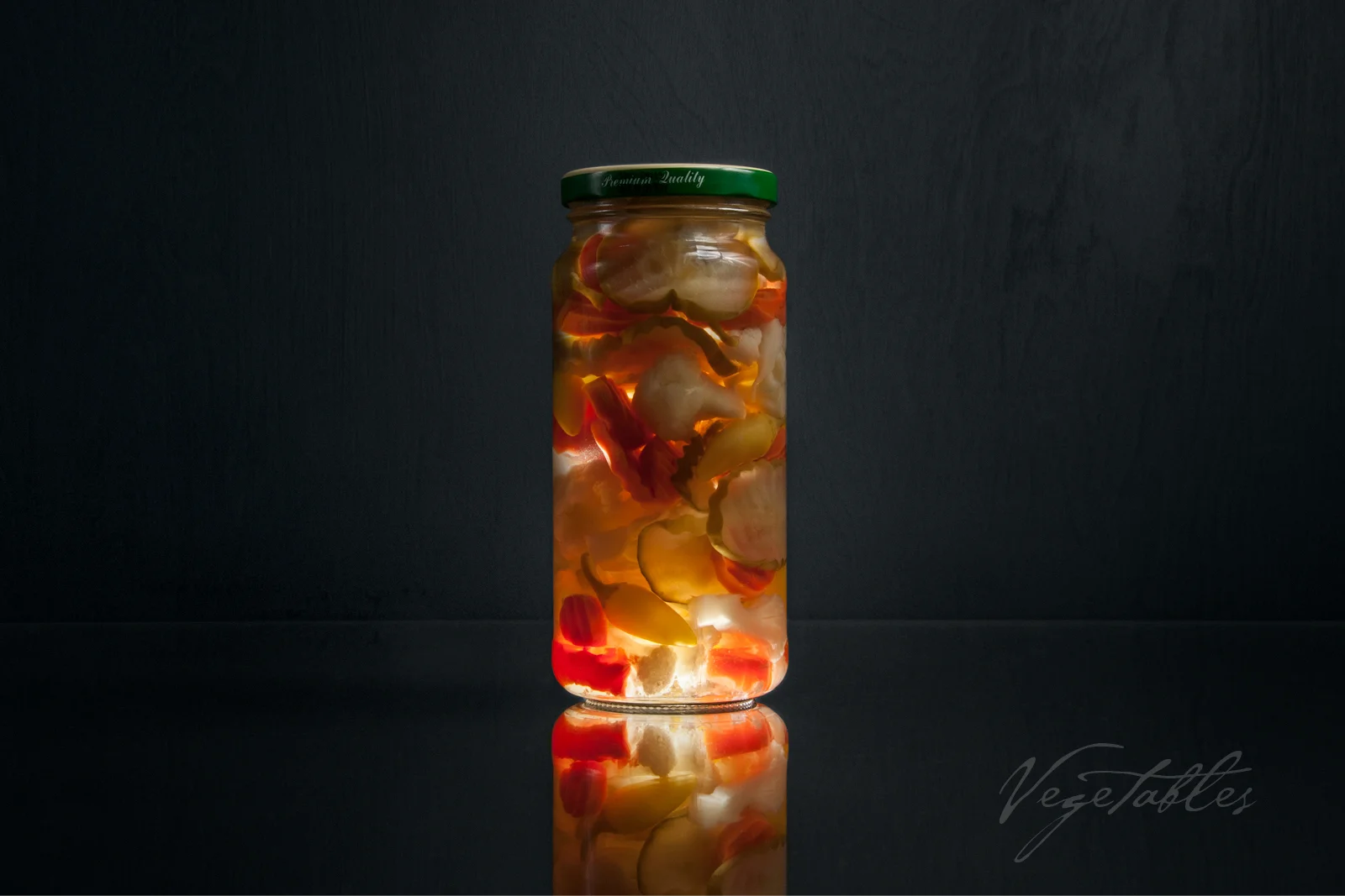
After getting a spark of inspiration while looking at a jar of pickles, I decided to build a small rig with some extra wood I had in my garage. The crux of it is a black backdrop, a black floor with glass on top of it and a hole, allowing me to place a flash pointing upward. With this rig in place, I did a series of photos of various bottled and jarred items. The idea was to see how these things would look if lit from within.

Apricot Jam in a jar

Artichokes in a jar

Asparagus in a jar
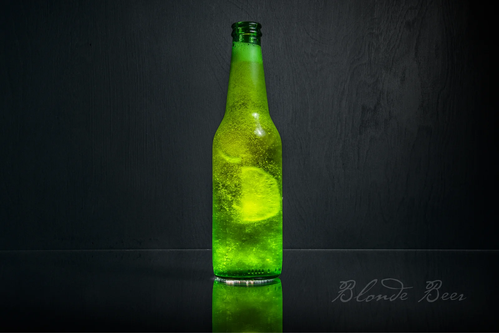
Blonde beer in a bottle with a side of lime
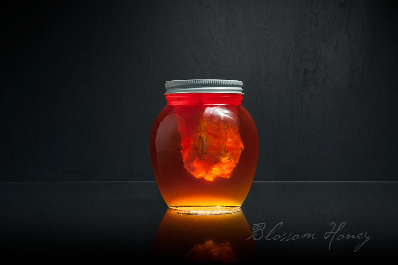
Blossom honey with honeycomb in a jar
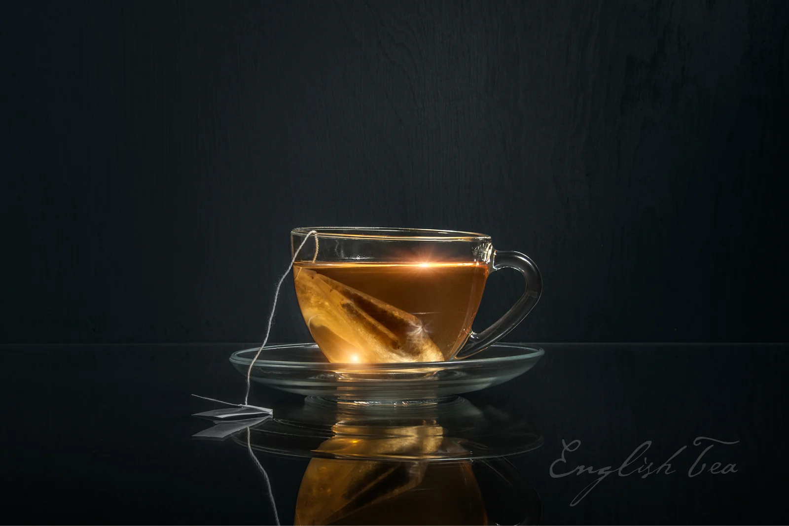
English team in a glass cup

Large chunk orange marmalade
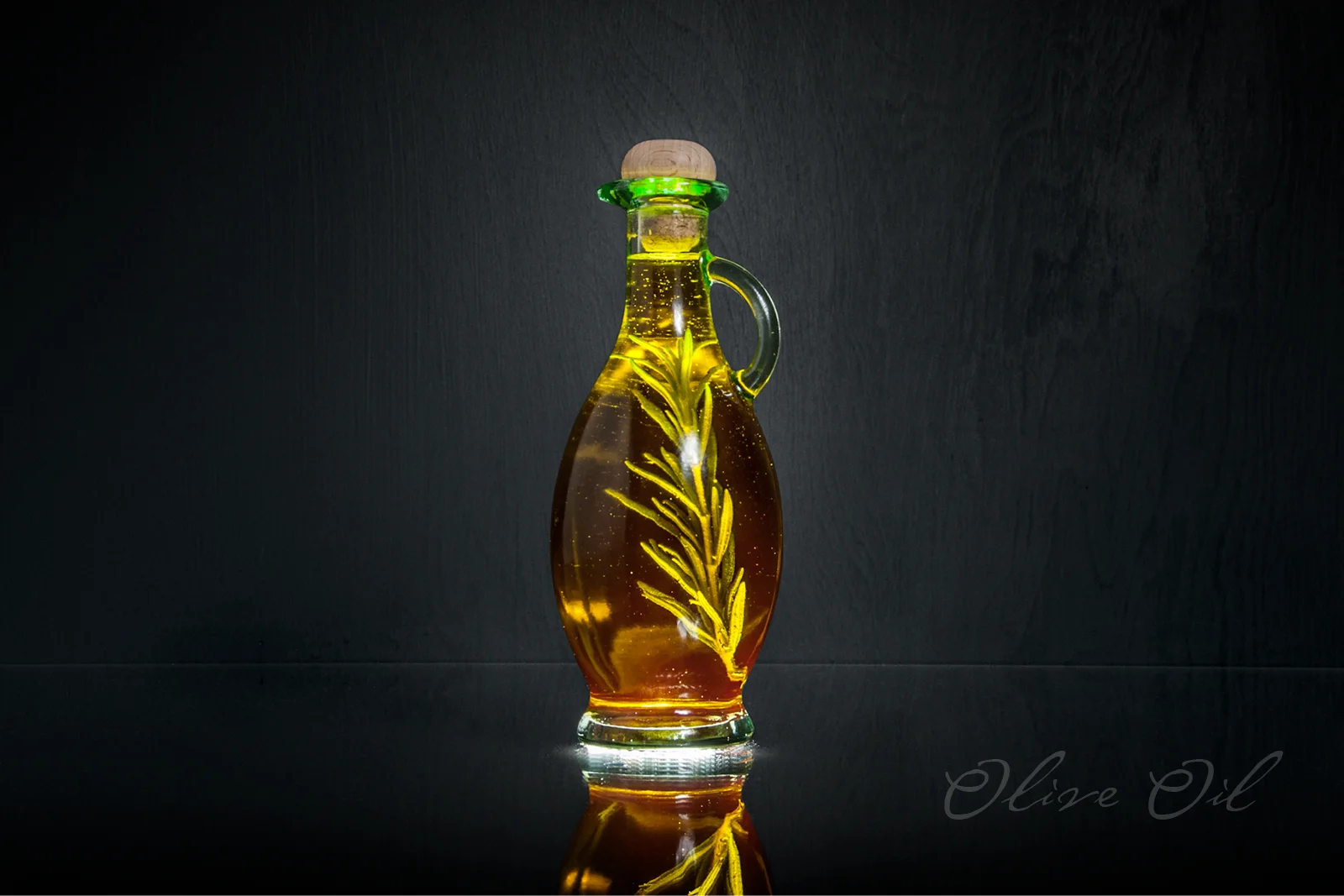
Olive oil with a rosemary sprig

Pickles in a jar
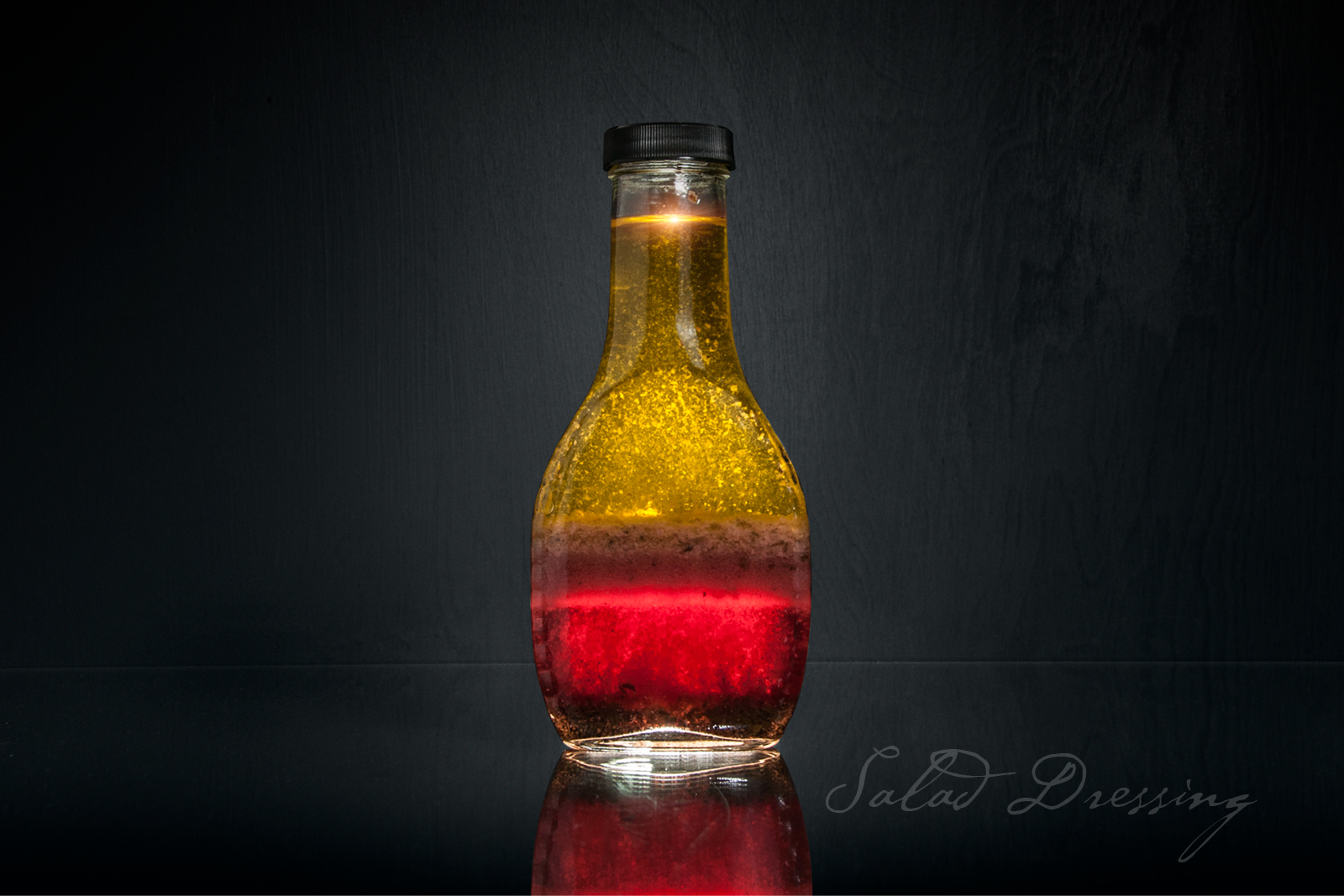
Champagne salad dressing
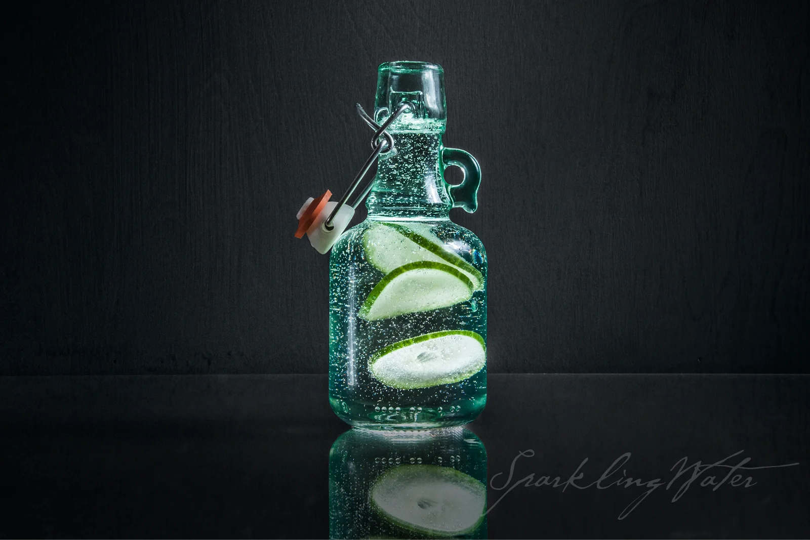
Sparkling water with cucumber slices
STAND-UP COMEDIEN, ACTOR, WRITER AND PRODUCER, CRAIG SHOEMAKER (ALSO KNOWN AS THE LOVEMASTER) CAME TO TETHOS TO BUILD A WEBSITE.
You might know Craig Shoemaker as the unmistakably engaging, iconic, baritone-voiced character, The Lovemaster. Maybe you were one of millions who saw him in his decades of successful stand up comedy. Or you may have seen one of his specials aired on Showtime, HBO, ABC, CBS, NBC and just about every other major network. Perhaps you saw him in a TV show or movie like Parks & Recreation, The Bold and The Beautiful, or in Scream 2?
But what you may not know is that Craig is dedicated to using laughter as a healing modality. And to this end, he asked Tethos to help create a website in preparation for his new endeavor "Laughter Heals."
After our standard discovery processor and working out a detailed site structure, we set out on designing a website which would focus on Laughter Heals while also encompassing the full "Craig Shoemaker" brand.
One of the first steps was creating both a simplified version of his existing logo to be used through the site and also to create a 3D rendered version of his logo to replace the two dimensional one that he had been using for many years.
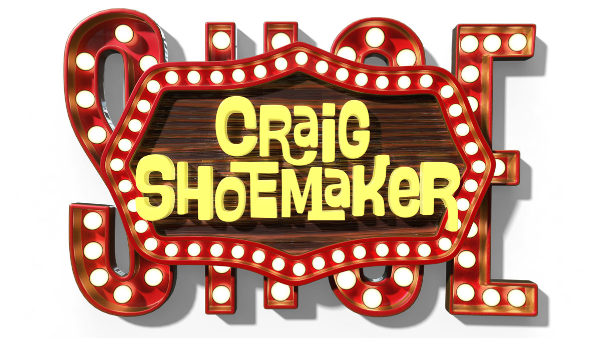
With this as a key element for the home page, we designed the rest of the page. Our effort here was to create a single page where all important information could be gleaned—without having to navigate to a different page. And thus recent videos, upcoming tour dates and information on his podcast are each featured.
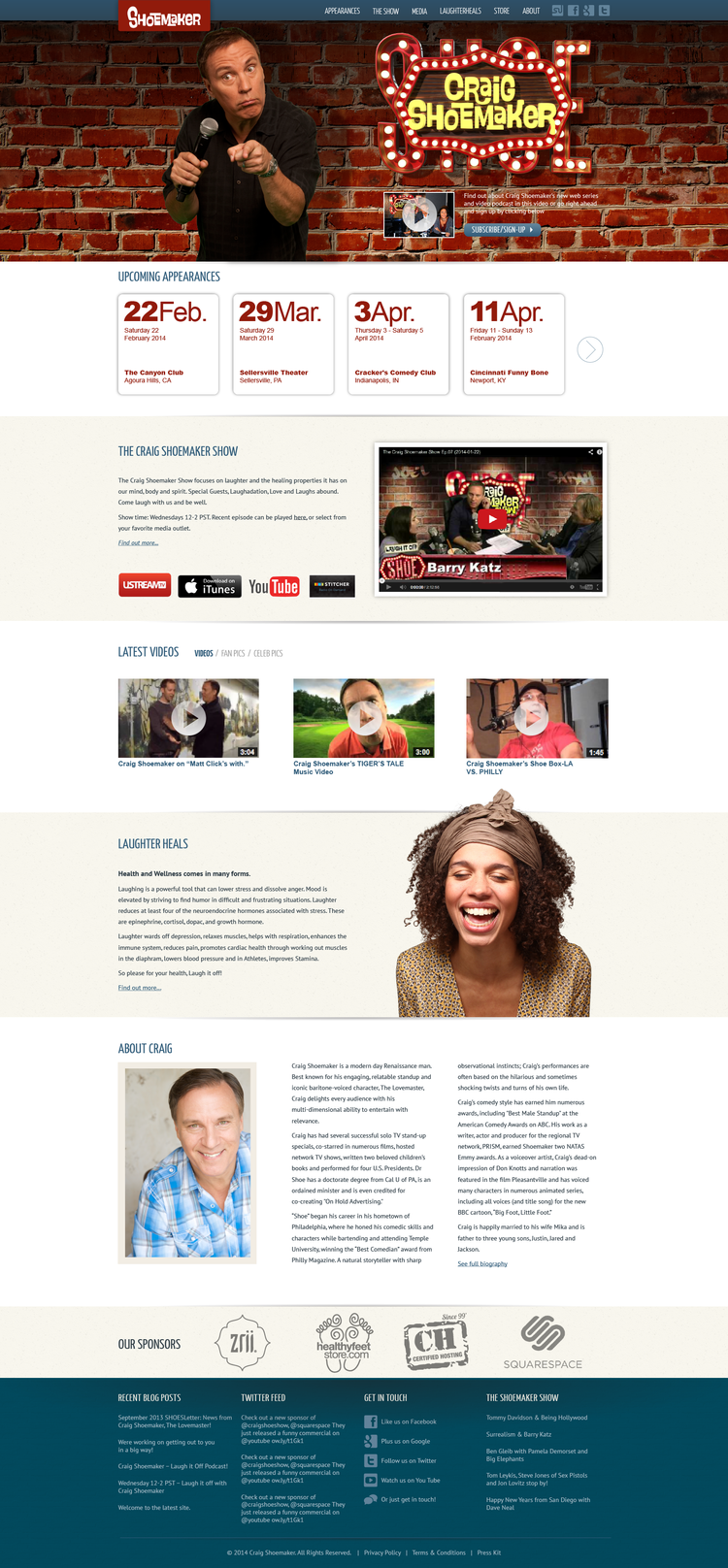
In addition to an upgraded design, the site also featured certain built-in functionalities.
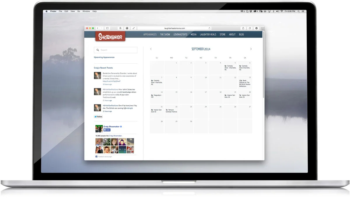
Integrated Twitter feed, Facebook page likes and pod casts were all part of the site along with a schedule of all upcoming tour dates.
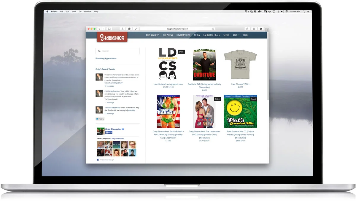
The site also includes built in e-commerce for all of Craig's retail items.
Creative Occasions is a family-run business based out of Arizona and serving areas throughout California and Arizona. Their purpose is simple—to make your special day the best it can be.
Creative Occasions approached Tethos with the task of branding their company and creating a website that would promote their various services.
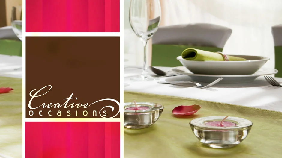
The first step was to create a logo, which can be seen above, along with a color scheme to be used throughout their branding, both physically and online.
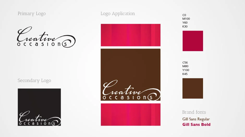
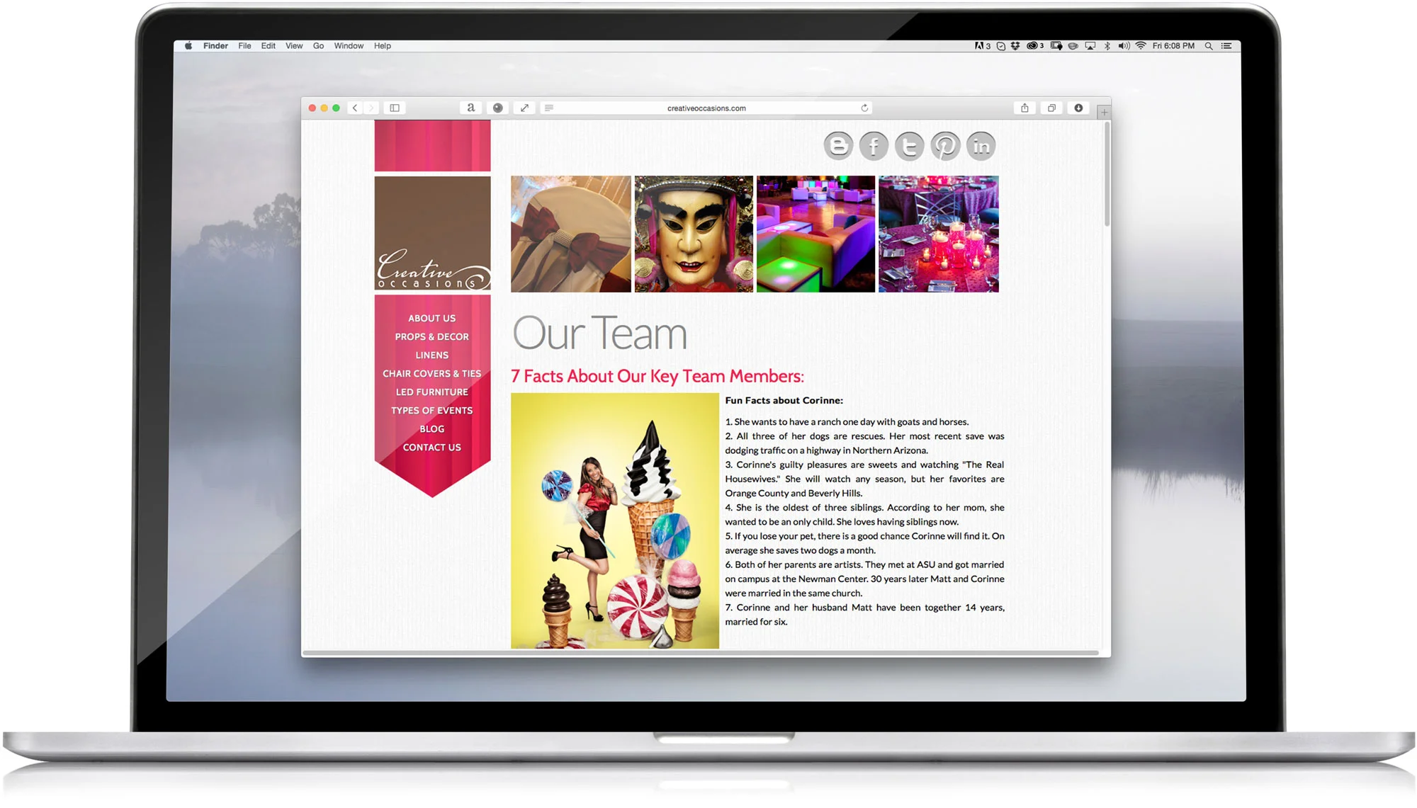
With a brand that the client was happy with, we then created a website for the company, including a mason grid home page with integrated secondary pages.
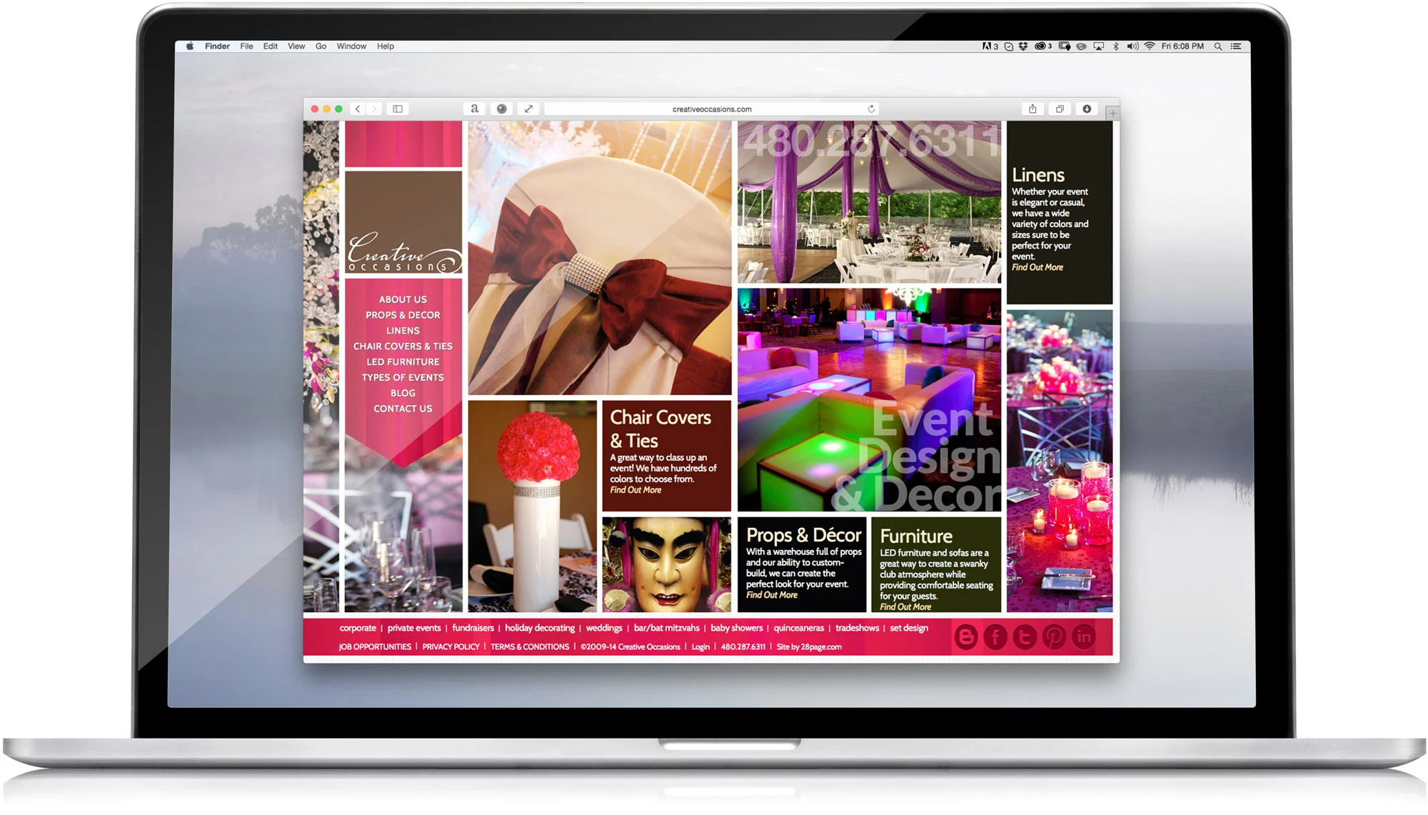
This is the home page of the website designed by Tethos. The business has since been sold.
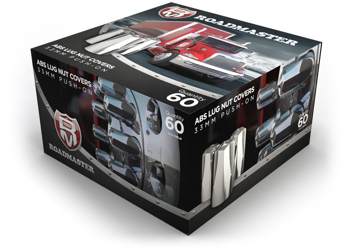
Tethos was tasked with creating new packaging for lug nuts for the truck accessories retailer Roadmaster. Their previous packaging had become dated and was also not competing well in a market where high end lug nut covers were being sold for the same cost.
The project started with a discovery process, looking at the packaging for similar or related fields. From this discovery process, we started putting together concepts.

After determining a direction that the client liked, we started putting together all of the elements necessary for our final package design.
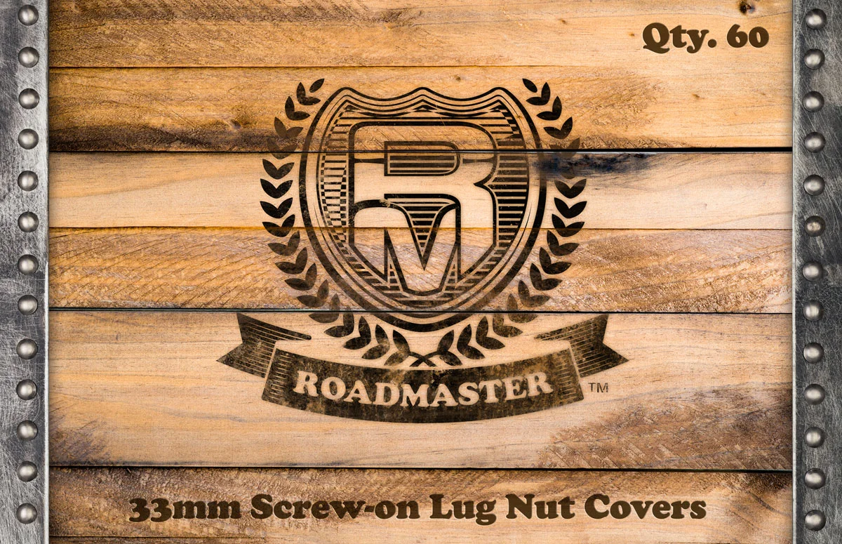
This first of these was a full 3D interpretation of their logo.

Due to budget constraints, the client was not able to get photographs of the product on a truck. To get around this, we built the products in 3D and then rendered them onto a truck.
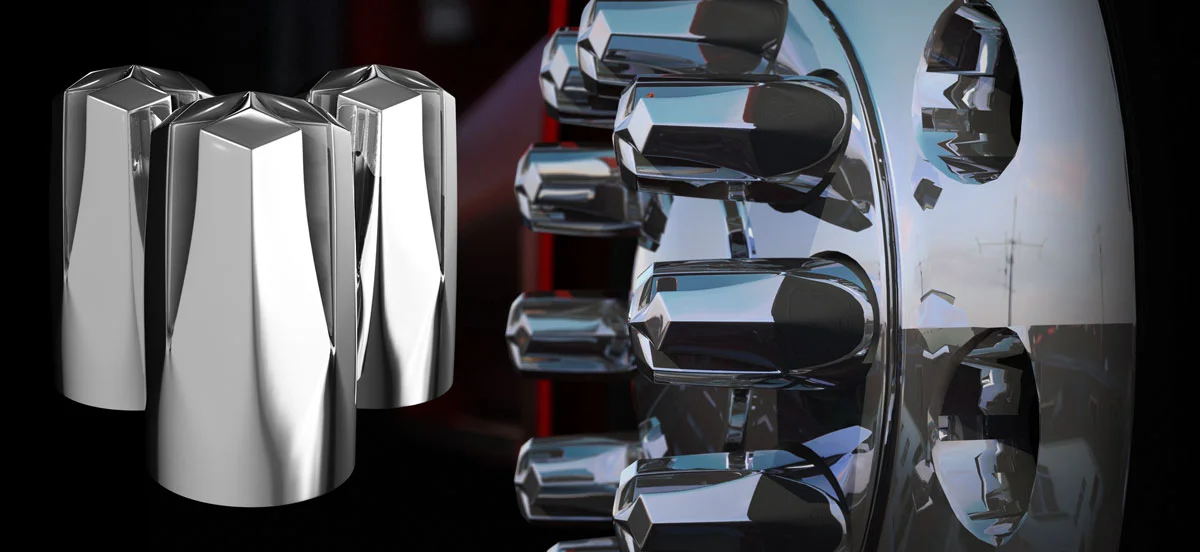

With all elements put together, we put together the final package, which can be seen in one of its iterations here. This was repeated 5 times for each of the different lug nuts.
